1. How Not to Data Visualize
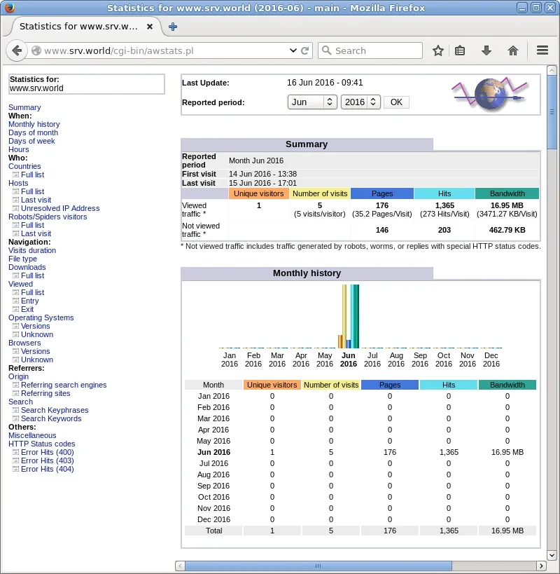
At the most commonly found level, a data visualization project consist of having some data, having a vague idea of the user’s actual needs, and a strong conviction that what you’re doing is perfect for the problem. Well, in 99.99% of the cases it’s not.
This process could be visualized kind of like this.
Non multa, sed multum
Not many things, but much.
after Pliny the Younger, Letters, VII.9
The picture a dog being sick in front of a baby: data, puked
It’s very easy to take data, mix it with some sort of “black magic” (read Javascript) and have everyone look at it in awe. But how about after the presentation? How about after first 10 uses? How about after a year? How about when something needs to be rapidly changed (because NOBODY gets the spec right at first go > analytics dashboards are a moving target because user needs are).
Larvatus prodeo
Masked, I go forward.
René Descartes, in his early notes
The meme “Javascipt & PHP”
The number one reason for frustration (user) and failure (business) regarding data visualization is “data puking”. Don’t just puke, tell a story that helps people to take action (change behavior).
Suum cuique pulchrum est
To each, their own is beautiful.
Cicero, Tusculan Disputations, V.63
The meme “I glued my head to my shoulder.”
The basic principle is that generally you’ll understand the value in your work better than anyone else does. Be very mindful of that.
2. Make it Goal Based
Around 2008 I led a team of young turks that shared a goal; start a new era in web analytics. At that point, Omniture had not been acquired yet, and Google Analytics was really bad. I mean really bad. There were three of us trying to change things — STATSIT, Nuconomy and KissMetrics — and show the big boys how to do it. I think to some extent we did show them, at least Google. Below is a screenshot from the keynote speech Avinash Kaushik, then Google’s head evangelist for analytics, gave in the Google Analytics summit in 2009. In it you see the goal setting view of STATSIT web analytics.
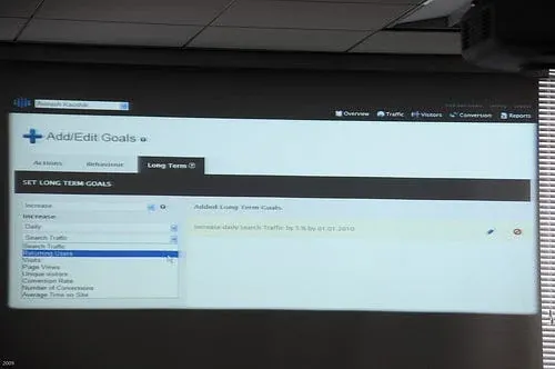
As the screen shows, almost 10 years ago, we had built-in goal setting for ‘behaviors’ and ‘long term’ goals, in addition to what were more commonly referred to as conversions. While ‘behaviors’ have to some extent become part of the analytics toolkit today, there is still much room for improvements in terms of ‘long term’ goal tracking. This is just one example of how analytics is nowhere as nearly goal-driven as it could/should be.
Related with the goal aspect, you could follow these 6 steps to avoid headaches later:
- Identify what the current goals of the user are
- Make sure that the visualizations correlate with that
- Create a simple prototype first
- After some use figure out what the goals now are
- Make changes rapidly (this will make users want it badly)
- Keep iterating
Here is an example of a simple user feedback loop:
Every way the customer speaks reaches the product, and customer development closes the loop back to the customer.
Now go do it. Forget bells and whistles and ‘wow factors’ until you figure out what the user actually needs. Note that ‘needs’ and ‘wants’ are often entirely different.
Going back to the point about starting simple, you might ask, how do you know it’s simple enough?
Everything should be made as simple as possible, but not simpler.
3. Data Visualization is about Behavior Change
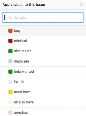
What do I want the user to do after they look at my visualization / dashboard? Most of the stuff, maybe 99% is “nice to know” with a sprinkle of “actionable”. A very simple example would be to use a color coding where the color already sends a contextually relevant message to the user. For example, something that is critical is darker red than something that is a bug. A nice to have would be light yellow, whereas must have would be darker yellow. We don’t see a lot of this.
But we do see (still) a lot of this.
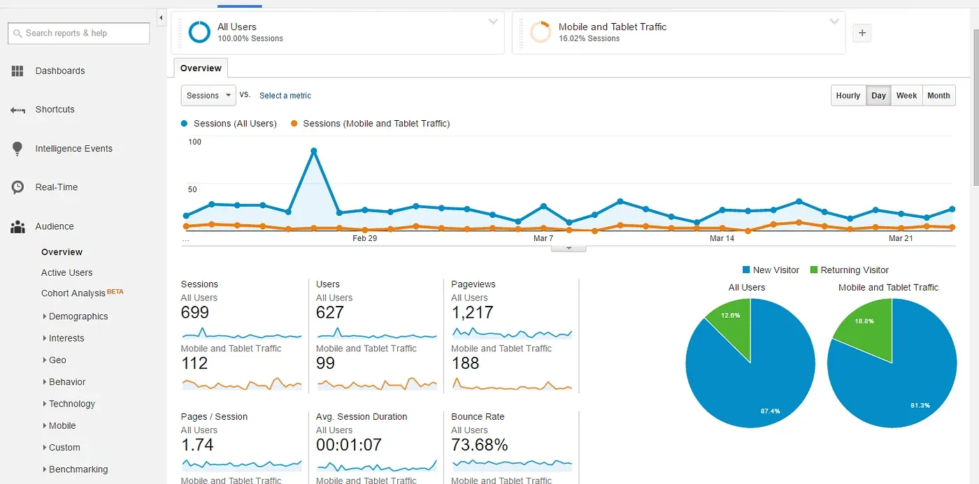
Endless menus, with endless depth and no indication of what to pay attention to (or what not to pay attention to).
4. Behavior Change is about Behavior Change
Behavior change is not some buzzword, but an actual thing. You can (and should) engineer it exactly like you should engineer other aspects of a visualization project. One of the best ways to get started with the idea of behavior change engineering, is to adopt a framework that is specifically made for the purpose.
The basic premise in behavior change is that you need three things:
- Ability
- Motivation
- Trigger
99(.9)% of all data visualization projects fail to appropriately address this. A good way to start learning about how to appropriately address it, is thinking carefully about the kind of behaviors you want the user to take.
| Green: do a new behavior | Blue: do a familiar behavior | Purple: increase a behavior | Gray: decrease a behavior | Black: stop a behavior | |
|---|---|---|---|---|---|
| Dot: done one time | Install solar panels on house | Tell a sister about eco-friendly soap | Plant more trees and native plants | Buy fewer cases of bottled water today | Turn off space heater for tonight |
| Span: for a period of time | Try carpooling to work for three weeks | Bike to work for two months | Recycle more of household waste for one month | Take shorter showers this week | Don’t water lawn during summer |
| Path: from now on | Start growing own vegetables | Turn off lights when leaving room | Buy more local produce | Eat less meat from now on | Never litter again |
The Behavior Grid, after BJ Fogg: fifteen kinds of behavior change, each with an example.
Once you know exactly the kind of behaviors you are aiming for, then you can identify the relevant abilities, motivations and triggers, and put it together in to some amazing dataviz!
5. Context is Everything
Technology (dashboards / plots / tables) are as useful as the context it’s in. For example, if you eat nothing but soup and I give you fork, then that is not a great technology at all. For salad eating on the other hand, fork is a brilliant piece of technology.
Move the point: where function meets context, a technology intervention fails or succeeds.
Generally what you think is relevant, is far less relevant to others. Because you tend to establish relevance based on your own ideas and preferences, and conversely others do it based on theirs.
For example, I needed to do a lot of descriptive stats tables, but I did not want to go out of my dev environment which is iPython / Jupyter. Painfully seeking high and low for a solution, I came to conclude that there was no meaningful way to do it without moving the data out first. I was proficient in two different visualization libraries (Matplotlib and Seaborn), Pandas and a bunch of other Pydata stuffs, but this is not something I could do with any of it. So I built it, which I find is often the best way to get exactly what you need the way you need it. In this case I was the user, so it’s easy to know the actual need. That’s the kind of match there should be between demand and supply.
| Tweet text | Median | Mean | Standard deviation | Total |
|---|---|---|---|---|
| Entropy | 0.602 | 0.595 | 0.031 | 29 |
| Number of words | 17.5 | 17.5 | 5.003 | 875 |
| Length | 140.5 | 129.22 | 20.981 | 6,461 |
Table 2 of the original post: tweet text statistics.
Then that led to doing some other really basic plots that I found it was hard to do with some of the well established packages out there:
Reach grows with influence, and steeply: the 172 accounts lie along one line.
- with their own picture
- egg accounts
- the larger the dot, the more retweets
- Reach grows with influence, and steeply: the 172 accounts lie along one line.
- The 26 egg accounts, with no picture of their own, sit low on it: half of them reach fewer than 40, half of the others about 1,000 or more.
- Three egg accounts reach almost no one: a reach of one. Two of them are among the three largest dots, as retweeted as any account here.
Later I made astetik into a python package so everyone else needing to do descriptive data tables could do it as well. I figured that might be a few people.
My last example is related with deep learning, the most froth inducing topic in the world of analytics. Again I was looking at what I could do with the libraries I already knew how to use, and what I could do with Keras or Sci-kit, or Tensorflow. None of it gave the exact thing I needed as my primary result view to get started in doing hundreds and thousands of tests with all kinds of data. None of it supported the kind of visualization I would need. So I started with this…
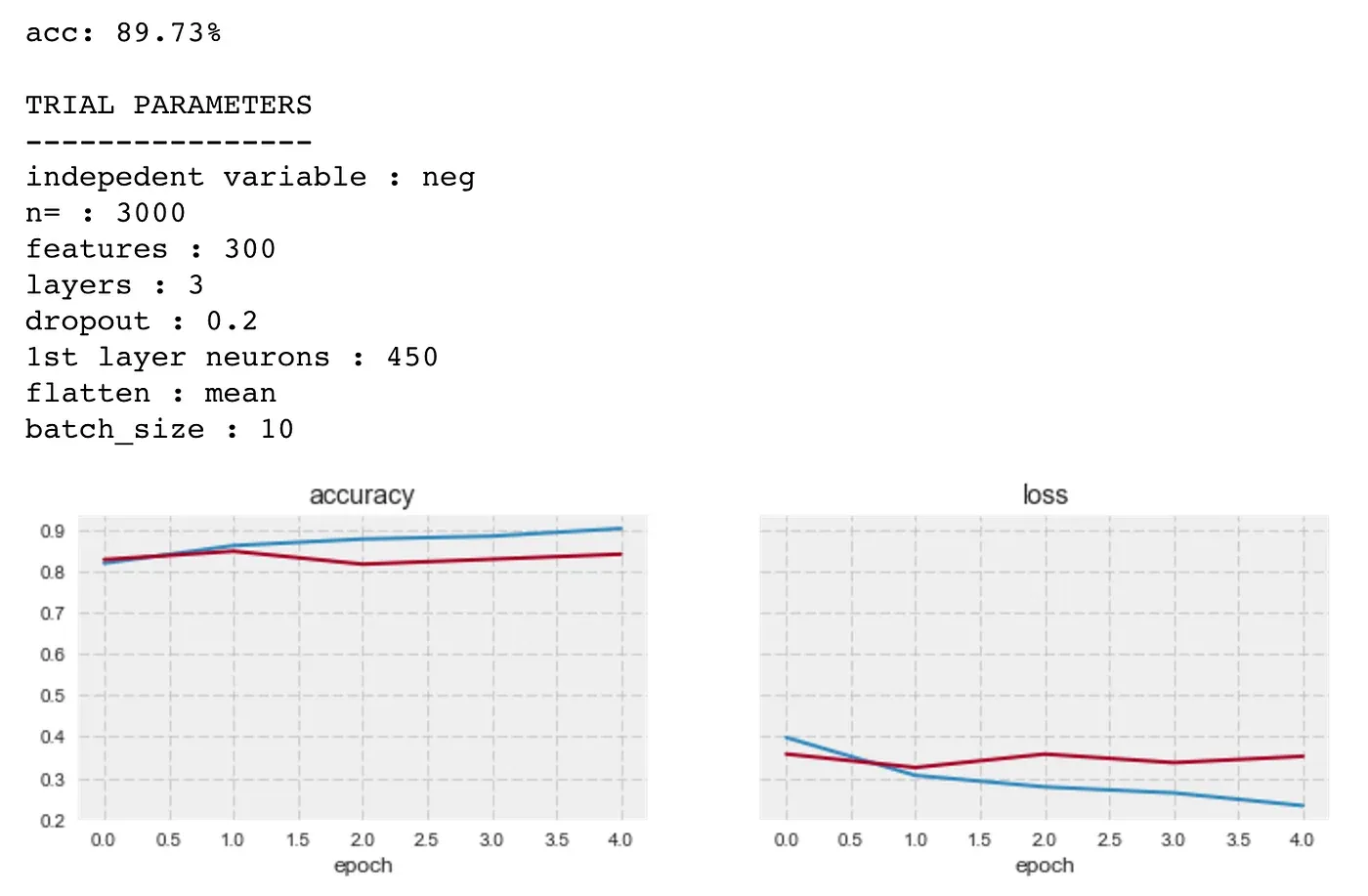
Then that led to the understanding of what I actually needed, so I was able to move forward building that.
Closing Words
Generally what you think is important (for yourself) is just a reflection of your limited understanding of the scope / domain. The more time you put into the initial build, the less likely you’re going to make significant changes (according to your actual needs) later. This is called emotional attachment, avoid it like plague. Or otherwise the whole thing may end up something like this…
Amantes, amentes
Lovers, out of their minds.
after Terence, The Girl from Andros
The picture two cats in party hats at a birthday cake
As a parting word, I want to leave you with something to think about. We often think that we’re experts in a given topic, and that’s really not helping. It’s much better to start with a blank sheet of paper, and assume to know nothing at all. Always go back to the needs of the user, and your inability to accurately understand it (even if you’re the user), and the way things are always changing and how analytics dashboards / dataviz is not like some art piece sitting in a museum (even though often it ends up like that) but a living, continuously evolving thing.
At best data visualization is a thing that can help make people’s lives less frustrating, their work more productive, and help them feel more joy in whatever it is that they are doing. Have fun!
In the beginners mind there are many possibilities, but in the expert’s mind there are few.